ZenmapInterface
An analysis of the Zenmap user interface
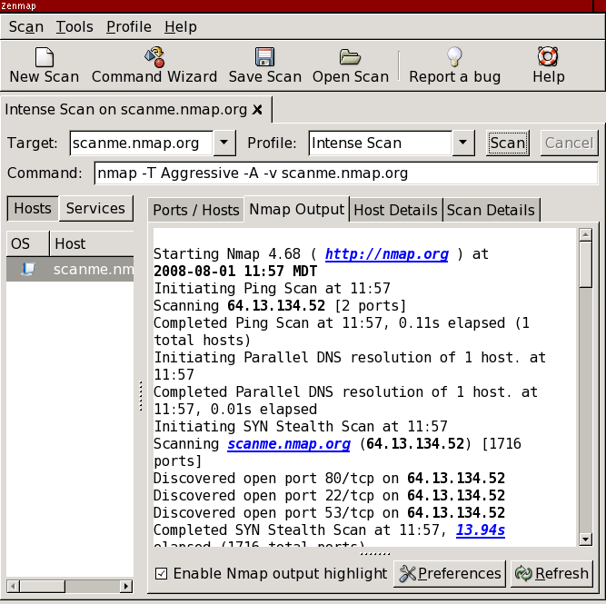
This is what Zenmap looks like after completing a scan.
Here is the same image with everything blanked out except for information relevant to the current scan.
Only 47% of the area of the interface is devoted to useful information. The remaining 53% is made up of window decorations, buttons, labels, toolbars, menus, scroll bars, tabs, and other controls. What space there is is poorly used. The hosts list can't show a single host name ("scanme.nm") let alone a host name and IP address. Poor alignment of the information displays is evident. The target is shown twice.
This is a reasonable goal for Zenmap: 90% or more of the area of the default screen is devoted to information rather than administrative debris. Let's start by shooting for 80%.
November 25, 2008
Here is what the Zenmap interface looks like since the Summer of Code 2008.
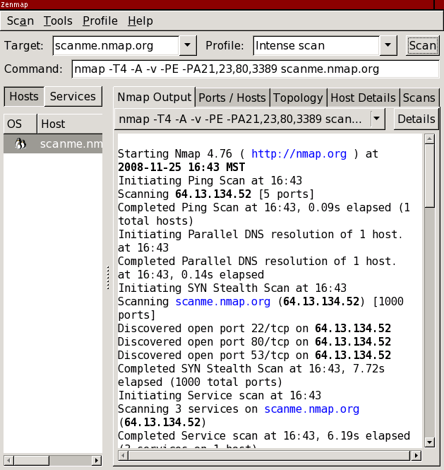
Effective screen usage is now 68%, a relative increase of 44% and an absolute increase of 21%. Not bad! Still that means 32% of the screen is occupied by controls and other non-information.